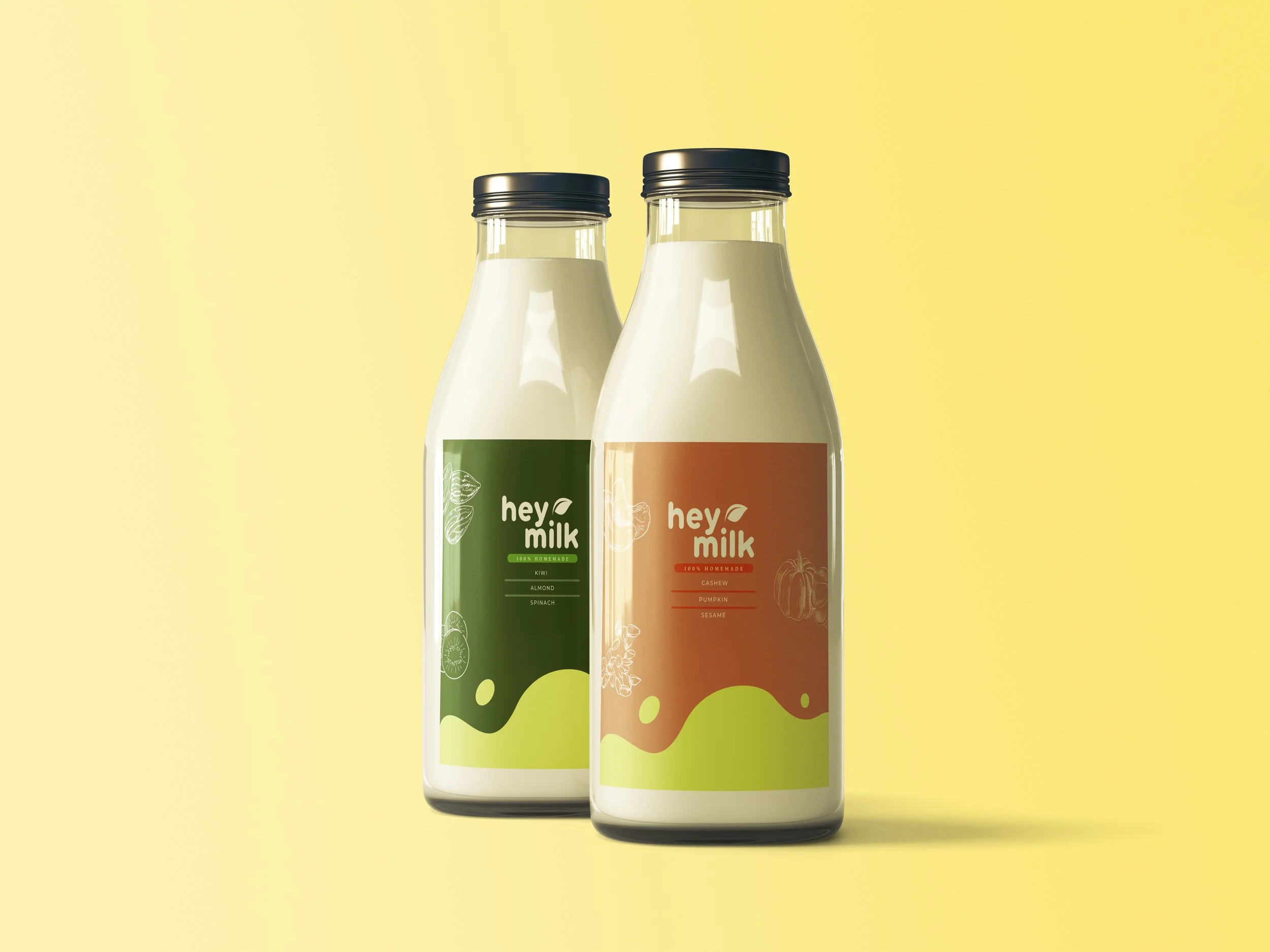
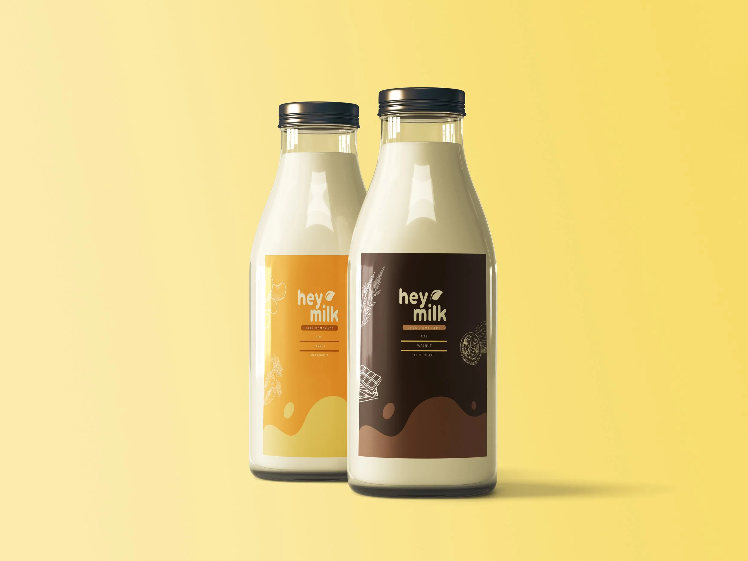
HEY MILK PACKAGING
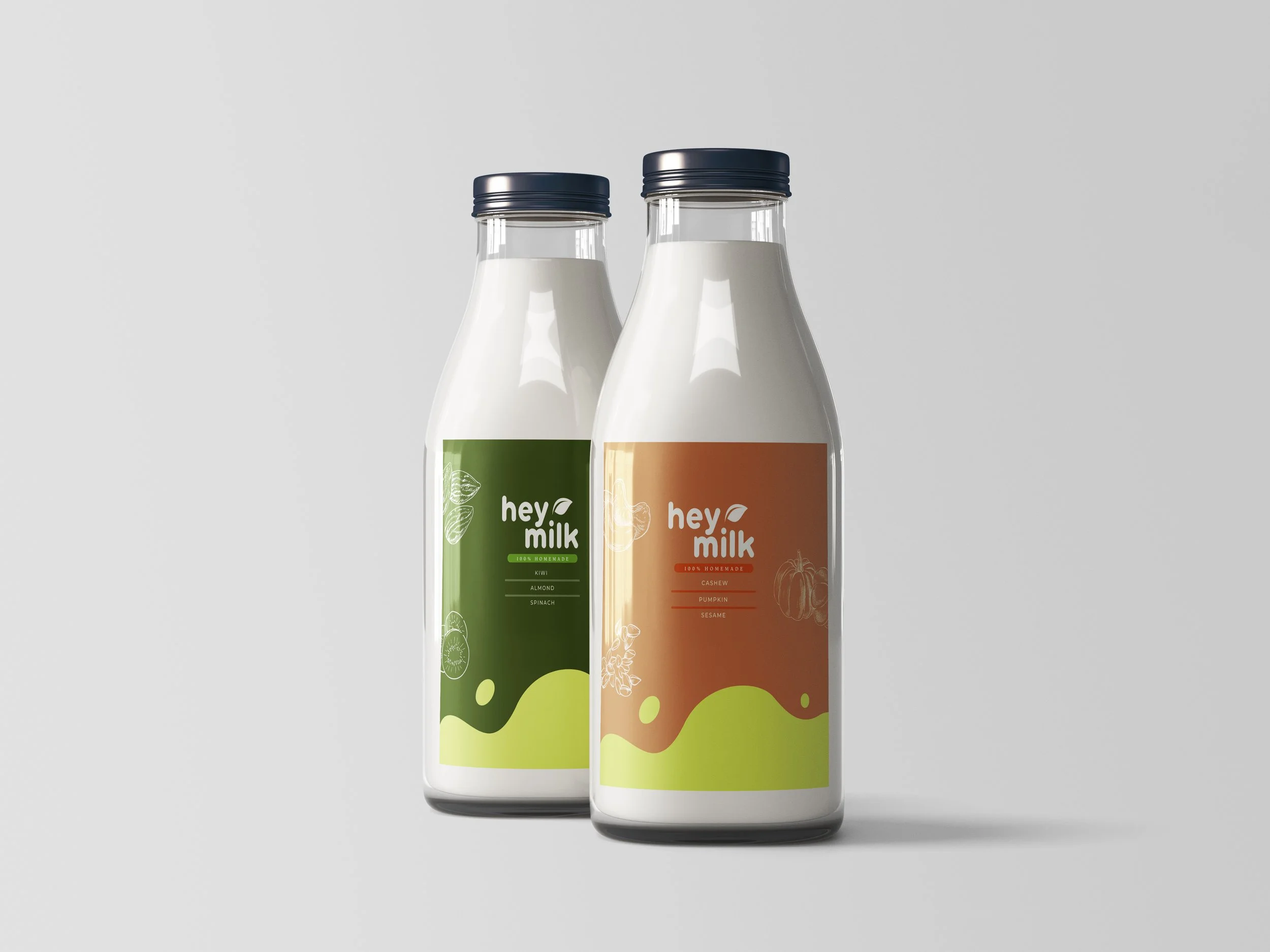
Hey Milk is an imaginary business mainly focusing on selling homemade alternative milk for lactose-intolerant customers.
The name of the brand is inspired by people when they do martial arts, they usually use this word to cheer up their minds. Therefore we want to use this word for the brand as it will evoke the motivated feeling that encourages people to try new alternative milk products that are better for their lives.
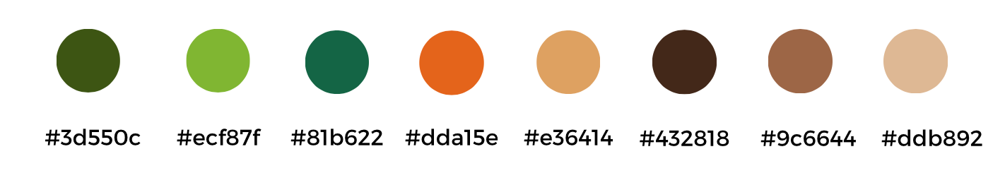
COLOUR PALETTE AND TYPOGRAPHY
The combination of different hues in green, brown and orange colours creates a vibrant and energetic palette. These colours reflect Hey Milk’s mission to provide delicious and healthy alternative milk options.
The colours are designed to evoke feelings of motivation, vitality, and well-being, encouraging customers to embrace new choices that enhance their lives.